This page shows the past designs of TFP from the first "without a lot of organization" one
until the last one you see right now in your primitive human screen. Click on the ScreenShot to go to the Design.
FLASH & ICONS Since [12.SEP.1999]
Made in Flash 4.0 (my first website), it was a high resolution design but had no space for updates. The original design was more like a normal
website, but it was to damn big (about 3 MB), so I had to upload just this cover an the rest of page were just pure standard HTML.
GREEN CORE Since [28.FEB.2000]
The classic green, orange and bluesky design. This new design had space for updates and a menu that
was only in the Principal Page but the other pages had not the same organization.
THE UNNAMED ONE Since [02.APR.2000]
The same classic colors but with some lines around. One of the best TFP designs, had a similar organization
in all the pages, but the sections didn't had the left menu.
PRO BLACK Since [03.SEP.2000]
The black and grey design. Great for almost everyone. A improved design with different colors, had all the
pages in the same way, it was simple and quick.
POINT, POINT, POINT Since [19.NOV.2000]
The blue and yellow design, with the menu at the right. A new design with more color. New menu bar on the right
and random pics in the logo. best design yet.
SQUARE & LINES Since [10.JUL.2001]
The squarest dark blue, grey and orange design. This one had a great kinda transparency in the logo and
headers and it was the only 3D design.
ALWAYS FUTURAMA Since [12.SEP.2002]
The grey, dark grey and bluesky design. First design with the menu at the left and
other stuff at the right. Great colors and better organization in all the sections.
BOTTLE NECK Since [27.MAY.2003]
Named in that way because it look's like a bottle (what???). This is the first design made along with PHP. Nice
colors and images from all the episodes with a nice blur effect for the text.
LOT OF SPACE Since [25.DIC.2003]
I made it originally for Xmas with no cool headers. After that I decided to leave the site with this layout
because it look knida cool. I name it "Lot Of Space" because the background is black (wow!... space) and features
the Planet Express Ship. All the scans used have no lines and it looks kinda cool in that way.
SKY & HEAVEN Since [14.SEP.2004]
One of the best designs I've made, features Futurama characters with heaven background,
and that sort of colors everywere. The first full screen design for this site, because it fits any resolution.
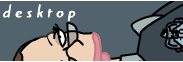
HANDY Since [20.JUL.2005]
I made this design because I wanted something new... and I was also trying to create a new design for the TFP Emergency Website.
I ended up adding close ups of characters hands as headers, and not main characters for the logo and disclaimer. Is not my best
design but I like those little details.
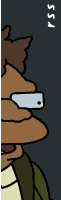
RETRORAMA Since [12.SEP.2006]
Yeap! I like this one because brown is one of my favorite colors. I wanted to create a retro design for this website a long time ago,
and this is it!. Features Amy Wong (yes! I'm an Amyholic) at the top and the Suicide Booth at the bottom. The Menu is kinda
bigger, and is also a full screen layout, but it looks nicer using a 1024x768 or better resolution.


 TO REGISTER YOUR DOMAINS